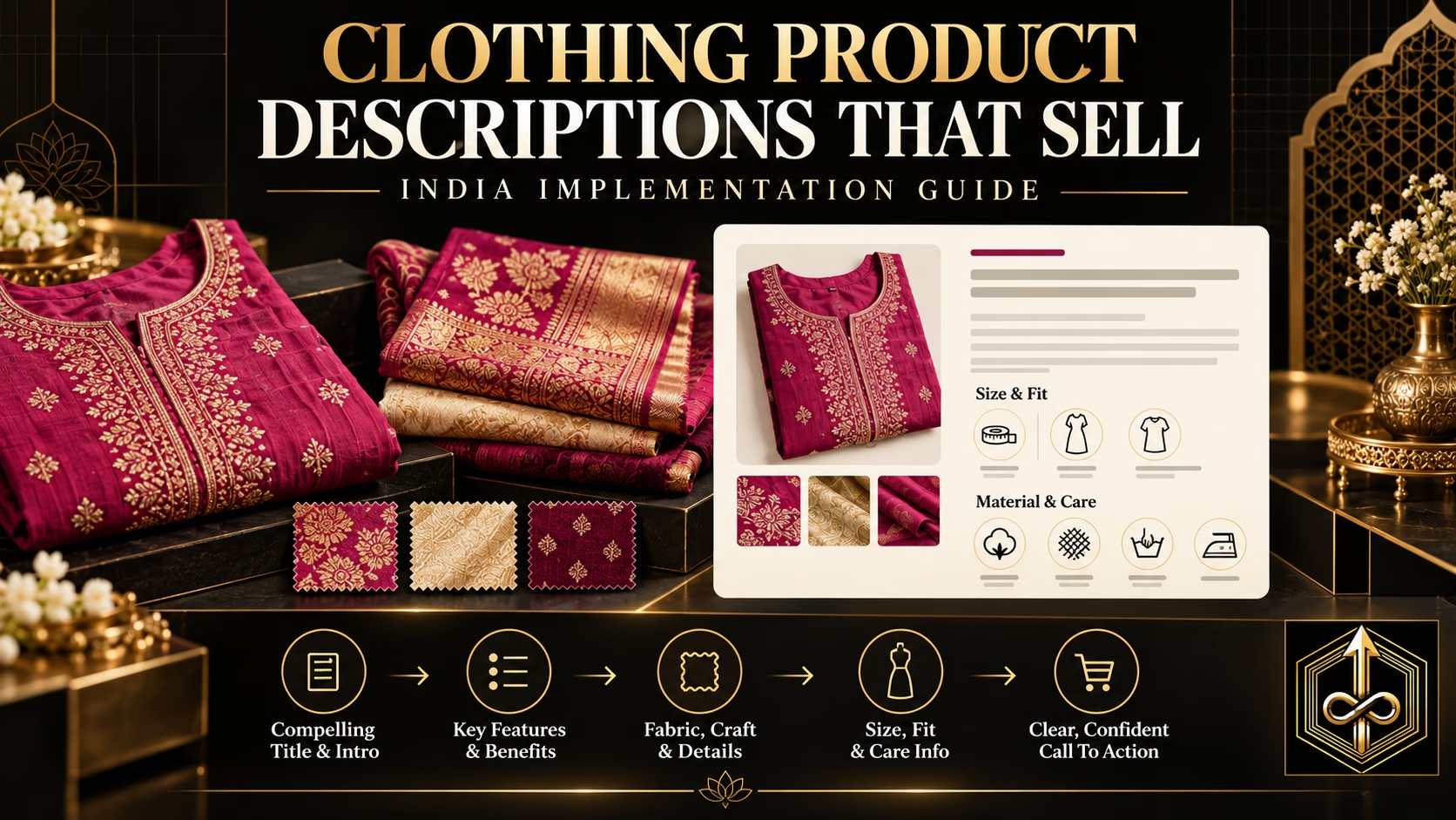

An ecommerce website for a clothing business must help a shopper choose the right product, understand the fabric and fit, trust the brand, complete payment or COD, and know what will happen after the order. A visually impressive homepage is only one part of that job. The commercial system also needs clear collection architecture, detailed product pages, accurate size guidance, mobile usability, reliable inventory, fast checkout, visible policies, measurement, search-friendly product data and an organised WhatsApp handoff for buyers who genuinely need assistance.
Direct answer: Build the website around the buying decision, not around decorative sections. Start with one defined buyer and a commercially focused collection. Create crawlable category paths, evidence-rich product pages, garment-specific size and fit guidance, transparent shipping and return information, a short mobile checkout, correct product tracking and a post-purchase system. Test every important path on a real phone before sending advertising traffic. A website becomes a sales asset when each page removes the next doubt and moves the customer toward a confident order.
What an Ecommerce Website Must Accomplish for a Clothing Business
A clothing website replaces many parts of an in-store conversation. In a physical shop, a salesperson can unfold the garment, explain the fabric, suggest a size, show matching pieces, answer delivery questions and notice hesitation. Online, the interface, content and support process must perform those functions without making the shopper work for basic information.
The site has four connected jobs. It must attract and orient the right buyer, help her discover relevant products, provide enough evidence to make a choice, and complete the order with minimum avoidable uncertainty. It must also give the business usable data. If the team cannot tell whether customers struggle with discovery, fit, price, delivery, payment or trust, the site cannot improve systematically.
A website is an operating system, not a digital catalogue
A catalogue can display photographs and prices. A selling system coordinates products, stock, variants, content, checkout, payment, order status, shipping, customer service, returns, analytics and retention. When these layers are disconnected, customers see out-of-stock variants, inconsistent prices, forgotten enquiries or unclear delivery promises. The front end may still look premium, but the experience does not feel reliable.
Map the website to the MDP Online Sales Engine
Buyer Clarity determines the navigation, language and merchandise emphasis. Product Presentation converts fabric, fit and craftsmanship into visible evidence. A Converting Website organises the buying journey. Traffic brings people from search, social, ads and existing communities. WhatsApp and Sales Conversion help buyers with legitimate uncertainty. Retention and Scaling turn order data and customer relationships into repeat demand. The website sits in the middle of this engine and must connect every layer.
Define success before choosing a theme
Write down the actions the site should support: discover a suitable collection, find an available size, compare products, understand fit, add to cart, choose prepaid or COD, receive confirmation, track an order, request an exchange and return for another purchase. Then define the business outcomes: valid orders, delivered orders, contribution after acquisition, lower avoidable support, fewer size-related returns and more repeat customers. A theme should serve these outcomes.
Business Readiness Before Website Design
Website projects often begin with colour palettes and banners because those decisions are easy to discuss. The harder inputs—product structure, customer questions, inventory ownership, margins, shipping rules and returns—determine whether the finished store can actually sell. Complete a readiness audit before design begins.
Clarify the catalogue
List every product family, category, subcategory, size system, colour option, material, occasion, price band and inventory rule. Decide which attributes are true variants of one product and which deserve separate products. A kurta offered in four sizes and two colours may be one variable product when the content is shared. A saree in a different weave or border may deserve its own page because the story, search intent and imagery differ.
Choose the hero categories that should receive the most attention. An established boutique may own hundreds of pieces, but the first website version should not treat every item as equally important. Prioritise collections that have clear buyer demand, sufficient stock or reliable replenishment, sound contribution and strong presentation material.
Assign data ownership
Decide who owns prices, stock, size data, photography, product copy, order processing, dispatch status, customer support and policy updates. Give each field one source of truth. If the website says a product is available while the store register says it is sold, the customer experiences the conflict. For an offline-and-online business, define how shop sales reduce online inventory and how website orders reserve stock.
Prepare fulfilment rules
Document serviceable locations, dispatch times, shipping charges, free-shipping thresholds, COD eligibility, exchange conditions, return conditions, cancellation rules and non-returnable products. Customised blouses, altered garments, made-to-order pieces and sale items may need different rules. The website must present the applicable rule at the decision point instead of hiding everything inside one long policy page.
Audit commercial viability
Do not assume that a product is suitable for paid traffic because it sells offline. Calculate the money remaining after product cost, packaging, payment fees, shipping subsidy, expected return or RTO burden, discounts and other variable costs. This amount limits what the business can spend to acquire an order. Use the detailed ecommerce profit, CAC and contribution-per-order guide before setting website offers or acquisition budgets.
Buyer Clarity and Positioning Before Layout
A generic fashion website forces shoppers to decide whether the brand is meant for them. A well-positioned site makes that answer visible through products, images, navigation, copy, proof and service. The goal is not to exclude every secondary buyer. It is to make the primary buyer feel that the store understands her context.
Define buying situations
Describe the customer through the decision she is making. “Women aged 25–45” gives a designer little direction. “Working women looking for polished, breathable Indian officewear with dependable sizing” shapes the collections, models, copy, filters and proof. “Family-function saree buyers who want a rich look with a manageable drape” produces a different website.
For each major buying situation, record the desired outcome, practical constraint, emotional concern, alternatives being compared and proof needed. A boutique customer may prioritise uniqueness and alteration support. A repeat kurti buyer may prioritise consistent fit and easy care. A premium clothing customer may need craftsmanship and service evidence before accepting the price.
Turn positioning into page decisions
If comfort is central, the site should show fabric composition, texture, movement, lining, transparency and care. If premium craftsmanship is central, use close details, process explanations, maker information and restrained offers. If inclusive sizing is central, garment measurements, fit notes, diverse model references and exchange support cannot be secondary content.
Keep one promise consistent
The promise in an Instagram reel or Meta ad should continue on the landing page. A campaign for breathable office kurtas should not lead to a homepage dominated by bridal wear. A premium ad should not land on a cluttered page filled with unrelated discount pop-ups. Message continuity reduces the mental reset between discovery and purchase.
Use the ideal-customer guide for product businesses to develop the buyer brief before the sitemap and design brief are approved.
Store Architecture and Navigation
Architecture serves shoppers and search engines. A shopper should reach the right product through predictable paths. Search engines should be able to follow ordinary links from the homepage to category pages and from categories to products. Google explains that internal links and navigation help it understand page relationships and relative importance. Its ecommerce guidance recommends linking through categories and subcategories to products rather than relying only on a search box. See Google Search Central’s official ecommerce site-structure guidance.
Build the catalogue taxonomy from customer language
Use categories customers recognise. Depending on the business, useful top-level paths may include Kurtas and Kurta Sets, Sarees, Co-ords, Dresses, Dupattas, Blouses, Bottoms, Occasionwear, Workwear or New Arrivals. Do not create a top-level category for every internal stock label. Navigation should express the buyer’s shopping logic.
Separate category, filter and campaign pages
A category page represents a durable product group that deserves navigation and search visibility. A filter narrows that group by size, colour, fabric, price or fit. A campaign landing page supports a temporary promise or audience. Treating every filter combination as an indexable category can create hundreds of thin or duplicate URLs. Treating every collection as a temporary campaign page weakens long-term discoverability.
Design the mobile menu first
The primary menu should expose the most useful paths without covering the screen with dozens of links. Use clear labels, logical nesting, visible close controls and touch targets large enough to select reliably. Keep account, cart, search and support actions easy to find. Test the menu in portrait view on several screen widths; desktop resizing alone misses real touch and browser-interface behaviour.
Create crawlable product discovery
Links should use standard anchor elements with usable destinations. Google’s link best-practices documentation explains that crawlable links and descriptive anchor text help discovery and understanding. If “load more” or infinite scroll is used, provide link-based pagination or another crawlable route so products are not available only after a scripted button click.
A High-Converting Clothing Ecommerce Homepage
The homepage should orient visitors and route them to the right buying path. It is not the place to show every product, every founder achievement, every policy and every social post. Its sections should answer: What does this brand sell? Who is it for? Why should I care? Where should I begin? Can I trust this business?
Above-the-fold content
Use a sharp hero image or short optimised visual that represents the primary collection. Pair it with a specific value proposition and one main action. “Discover breathable Indian workwear designed for long days” communicates more than “Welcome to our world of fashion.” If a seasonal collection is the commercial priority, name it and link directly to it.
Collection routes
Show a manageable set of collection tiles based on real shopping behaviour. A saree brand may route by weave, occasion or weight. A kurti brand may route by workwear, festive sets, fabric or fit. A boutique may route by ready-to-ship, made-to-order and consultation. Keep image crops consistent and labels explicit.
Evidence and reassurance
Introduce the most important trust points without using unsupported claims. Show clear delivery coverage, payment options, exchange availability, customer-support method, physical-store identity where relevant and genuine review or press proof only when permission and source records exist. Avoid decorative badges that do not correspond to a real process.
Merchandising blocks
Use New Arrivals, Best Sellers or Editor’s Picks only when the labels are maintained. Curate products around a buyer purpose and explain the selection. “Lightweight sarees for long functions” is more useful than another grid titled “Featured Products.” A short styling or education block can help customers compare fabrics, fits or occasions and lead naturally to editorial content.
Homepage restraint
Every auto-playing slider, pop-up, floating button and animation competes for attention and can affect performance. Keep only elements that help a decision or capture a valuable relationship. If a first-visit discount pop-up hides the value proposition before the visitor understands the brand, delay it or use a quieter format.
Collection Pages, Search and Filters
Many customers enter through a collection page from Google, Instagram, an ad or a shared link. Treat collection pages as landing pages, not as bare product grids. They should define the range, help shoppers narrow it and make comparison easy.
Collection-page essentials
Use a clear heading, concise introduction, relevant image, useful sort options, accurate product count and consistent cards. Product cards should show the item name, price, available colour context where useful, meaningful badge states and a stable image crop. If an item is sold out, state it before the shopper opens the product.
Fashion-specific filters
Useful filters may include size, colour, fabric, silhouette, sleeve, neckline, occasion, price, availability, saree weave, blouse inclusion, fit or length. Add only attributes the product team can maintain accurately. A filter with missing values erodes trust and makes products disappear incorrectly.
Search that understands the catalogue
Site search should recognise product names, categories, common spellings and relevant attributes. Review no-results searches to learn the language customers use. Redirect common synonyms only when they represent the same intent. Search is also a research tool: repeated queries for “feeding kurti,” “petite,” “office cotton” or a specific colour can reveal merchandising and content gaps.
Pagination and load-more controls
A long category may use pagination or incremental loading for performance. Google states that crawlers generally follow URLs in link attributes and do not operate buttons like a shopper. Its pagination guidance for ecommerce sites recommends sequential links and distinct URLs. Design the visual experience and crawl path together.
Merchandise intentionally
Do not sort solely by upload date. Promote products that fit the collection promise and have viable stock. Use manual curation for launches and key categories, then monitor whether customers can find sizes and price bands without endless scrolling. Out-of-stock products can remain useful when they have demand and a return plan, but remove them from prominent acquisition paths when replenishment is uncertain.
The Clothing Product Page Blueprint
The product page carries the greatest burden because clothing cannot be touched or tried online. Its job is to transform physical characteristics into visible, readable and believable evidence. The page should answer the questions that normally appear in a sales conversation before the shopper needs to ask them.
Product title
Use a clear name with the most useful distinguishing details. A title such as “Rani Pink Tissue Saree With Gold Zari Border” helps the buyer and product-data systems more than an internal code or poetic collection name alone. Keep the brand’s creative name as a secondary detail if it does not explain the product.
Price and offer clarity
Show the selling price, applicable tax treatment, genuine compare-at price only when valid, set contents and relevant shipping threshold. If the displayed price changes by size or customisation, explain it before selection. Do not reveal mandatory charges only at the last checkout step.
Variant selection
Make size and colour choices obvious, labelled and keyboard accessible. Disable unavailable combinations rather than allowing failure after add-to-cart. Show the selected colour name next to the swatch because screens and perception vary. When a product has many combinations, keep stock synchronised at the purchasable variant level.
Fit and model information
State the model’s relevant measurements, worn size, garment fit and useful fit advice. “Relaxed through the waist; choose your usual size” is more useful than “perfect fit.” For fitted garments, explain stretch and key garment measurements. For sarees, explain length, width, blouse-piece length and whether finishing shown in images is included.
Fabric and construction evidence
List fibre composition when known, lining, transparency, stretch, weight or drape, surface work, closures, pockets, care and country of origin where applicable. Avoid substituting vague words such as “premium fabric” for facts. If a handloom, handmade or craft claim is used, ensure the business can support it.
Delivery, return and support at the decision point
Show an estimated dispatch window or delivery estimator, payment choices, exchange eligibility and a short return summary near the purchase action. Link to the full policy. For custom or made-to-order items, state the longer timeline and any altered cancellation rights before payment.
Product storytelling
After decision-critical facts, explain the design purpose, styling options, occasion suitability and construction details. Write for the product in front of the buyer. Repeating the same generic paragraph across hundreds of pages weakens usefulness and makes the catalogue feel mass-produced.
Related recommendations
Recommend complementary or alternative products with a reason: a matching bottom, blouse, dupatta, jacket, jewellery pairing, similar silhouette or lower-weight alternative. Ensure suggestions are in stock and do not interrupt the main choice. The goal is a better order, not a larger random cart.
The complete ecommerce product-page optimisation guide provides a deeper field-by-field framework that can be used as the specification for every product template.
Product Photography and Video
Photography is part of the product, because the buyer can only evaluate what the website reveals. A single front image may attract attention but cannot establish fit, colour, construction and scale. Plan a repeatable evidence sequence for every product family.
A clothing gallery sequence
Begin with a clean full look that represents the product accurately. Follow with front, back and side views; closer fabric and surface-work details; fit or drape in motion; key functional details such as pockets, closures and lining; scale or model reference; styling possibilities; and set contents. For sarees, add pallu, border, blouse piece, weave texture and a drape video. For kurtis and sets, show the complete set, neckline, sleeves, hem, bottom, dupatta and opacity.
Consistency without sameness
Use consistent lighting, framing and background rules so customers can compare products. Add lifestyle images when they clarify use and brand character. White or neutral-background images support evaluation; lifestyle images support imagination. Both can work together when colour remains accurate.
Video should resolve a question
Use short videos to show movement, fall, shine, transparency, stretch, texture, fit or styling. Do not make every video a rapid montage. A stable view of the garment can be more persuasive than transitions that hide details. Include captions or useful text when sound is not essential.
Optimise image delivery
Use descriptive filenames, accurate alternative text, responsive dimensions and compression that preserves fabric detail. Google’s image SEO documentation recommends standard HTML image elements, responsive images, supported formats and an appropriate balance of speed and quality. It also explains that alt text and surrounding page content help search engines understand an image.
Use the ecommerce product photography guide for Indian businesses to create the shooting brief and quality-control checklist.
Size, Fit and Return Prevention
A size chart is useful only when customers can apply it to the garment. Generic body measurements copied across unrelated silhouettes often create false confidence. Size guidance should connect the buyer’s measurements, the product’s measurements and the intended fit.
Choose and label the measurement system
Explain whether measurements are body measurements or finished garment measurements. State the unit. Show how bust, waist, hip, shoulder, sleeve, length and other relevant points are measured. If a style has unusual ease, stretch or cut, provide product-specific notes.
Make the chart product-aware
Different suppliers and patterns may use different grading. Do not force every item into one chart unless the production system supports it. A straight kurta, fitted blouse, oversized shirt and elasticated co-ord need different decision help. Link the correct chart from the variant selector rather than hiding it in the footer.
Show the reference on real bodies
Provide model measurements and worn size. When feasible, use more than one fit reference or customer-approved fit imagery across the range. Avoid promising that a size will fit everyone with similar height or weight; body proportions vary. Guide through measurements and exchange support.
Collect return reasons as product data
Record whether a return involved size, length, colour expectation, transparency, fabric feel, damaged item, wrong item or a changed decision. Review reasons by SKU and supplier. Repeated “too tight at bust” feedback should change the product note, imagery, chart, pattern or stocking decision—not only the customer-service script.
Build preventive content
Add a measuring guide, fit notes, stretch indication, garment measurements, colour disclaimer grounded in actual photography and a simple path to ask a pre-purchase question. Make the guidance visible before add-to-cart. A strict policy does not compensate for unclear fit information.
Mobile Experience and Accessibility
Many clothing shoppers arrive from Instagram, WhatsApp, Facebook ads or Google on a phone. The mobile experience is therefore the primary storefront. Responsive design is more than shrinking desktop columns. It requires deliberate content order, readable controls and a purchase path that works with a thumb, software keyboard and unstable network.
Mobile content priority
Show the product, price, variant selection, size help and purchase action without burying them beneath decorative copy. Keep the main heading readable and avoid full-screen banners that obscure the next step. Sticky add-to-cart controls can help on long pages when they reflect the selected variant and do not cover policy or accessibility controls.
Navigation and touch
Test opening, scrolling and closing every menu level. Keep tap targets separated. The cart and search icons need accessible labels, not only visual symbols. Avoid hover-only information because touchscreens have no reliable hover. Ensure focus states remain visible for keyboard users.
Readable product content
Use adequate contrast, comfortable line length, sensible text size and meaningful spacing. Do not place grey body text over black or text directly over a busy garment image. Tables and size charts should adapt to a narrow screen or offer controlled horizontal scrolling without forcing the whole page wider.
Forms and errors
Use the correct input type for phone, email and postal code. Keep labels visible after typing. Explain errors beside the affected field and preserve valid entries when another field fails. Test auto-fill, coupon entry, UPI redirection, back navigation and order confirmation in real mobile browsers.
Accessibility supports conversion
Alternative text, form labels, logical heading order, keyboard operation, captions and sufficient contrast make the store usable for more people and reduce ambiguity for everyone. Use the W3C Web Accessibility Initiative as the standards reference rather than treating accessibility as a final plugin checkbox.
Speed and Technical Reliability
Clothing stores are image-heavy, but the customer still expects a responsive experience. Speed work should preserve the visual evidence needed to buy while removing waste. The goal is not a perfect laboratory score at the cost of broken galleries or missing tracking.
Control image weight
Export images at dimensions appropriate to their displayed use. Generate responsive sizes, use modern supported formats where compatible, compress carefully and lazy-load content below the initial viewport. Do not send a full-resolution campaign photograph to a small product card. Protect the first important image from late discovery or unnecessary script delays.
Reduce theme and plugin overhead
Each visual builder add-on, pop-up tool, review widget, chat widget and tracking script can add code or network requests. Maintain a list of active functions and remove unused duplication. Test after updates. A plugin that provides no current business value still creates maintenance and performance cost.
Protect interaction quality
A page can appear loaded yet respond slowly when scripts occupy the browser. Test menu opening, size selection, gallery swiping, filters, add-to-cart and checkout interactions. Prevent layout shifts by reserving space for images, banners and injected widgets. Monitor field performance where possible because real customer devices and networks differ from office testing.
Build operational resilience
Use HTTPS, maintained software, reliable backups, staged updates, appropriate security controls and uptime monitoring. Test payment and transactional email after major changes. Document how to restore service if a theme, plugin, gateway or deployment fails. Security rules should block abuse without blocking customers, search crawlers or the team’s own quality checks.
Cart, Checkout, Payments and COD
The checkout should confirm the decision, collect the minimum required information and set expectations. Extra steps, surprise costs and forced accounts can turn a confident shopper into an abandoned cart.
Keep the cart useful
Show a clear product image, title, colour, size, quantity, price and estimated totals. Allow quantity changes and removal without losing the page state. Surface shipping thresholds and coupon fields carefully; a large coupon field can tell full-price buyers that they are missing a discount.
Design a short checkout
Ask only for information needed to fulfil, communicate and meet applicable requirements. Support guest checkout when the business model allows it. Use a clear order summary, visible total and payment choices. Do not make customers create a password before completing a first purchase.
Support Indian payment behaviour
Offer the payment methods the gateway and business can reliably support, such as UPI, cards, net banking and COD where commercially appropriate. Explain redirection or pending-payment states. Do not show a successful order until the system has a valid result or a clearly labelled pending state.
Use COD as a controlled service
COD can remove payment hesitation but can also create confirmation, cancellation and RTO work. Define eligibility by real business rules rather than habit. Consider confirmation workflows, address validation, risk review and prepaid incentives that preserve margin. Track placed, confirmed, shipped and delivered COD orders separately.
Handle failed and pending payments
Give the shopper a clear way to retry without creating duplicate orders. Preserve the cart, show support information and send a message that reflects the true payment state. Reconcile gateway, website and bank records. A failed-payment message should not claim that money was never debited if the system cannot know that yet.
For the commercial trade-offs, see the COD versus prepaid ecommerce guide for Indian brands.
Trust, Policies and Customer Support
Trust comes from consistency between the promise, page, payment, delivery and support experience. A logo row can reinforce trust, but it cannot replace accurate information and dependable operations.
Show the real business
Use an About page that explains who operates the brand, what it sells and how customers can contact it. Display the registered business details required for the business context, a working support channel and physical location where relevant. Founder visibility can help when it is authentic and connected to customer value.
Write policies customers can use
Publish shipping, return, exchange, cancellation, privacy and terms pages in plain language. Include time windows, conditions, exclusions, process, refund method and support route. Do not copy another store’s policy. Match the policy to actual operations and applicable legal advice.
Place reassurance contextually
A size-related exchange summary belongs near the size decision. Dispatch information belongs near purchase. Payment security belongs in checkout. A full policy link remains necessary, but customers should not need to leave the buying path to answer a predictable question.
Use genuine reviews responsibly
Show verified or permissioned customer feedback without inventing names, outcomes or ratings. Keep review moderation rules consistent. Product-specific feedback is especially useful when it mentions fit, fabric, colour, delivery or use. Do not mark editorial text or internal testimonials as customer reviews.
Make support accountable
State support hours and realistic response expectations. Route order-status, exchange and product questions to the right owner. Give the team access to product and policy information so answers remain consistent. Measure repeated questions; each repeated question may indicate missing page content.
SEO, Product Data and Google Visibility
SEO for a clothing website begins with a crawlable, useful catalogue. Blog articles can attract research-stage visitors, but category and product pages must accurately describe what the business sells. Search engines cannot reliably understand products hidden behind scripts, inconsistent variants or duplicate URLs.
Keyword mapping
Assign one primary search intent to each important page. The homepage usually represents the brand and broad proposition. Category pages represent durable product groups. Product pages represent specific items and attributes. Editorial guides answer questions and support categories through contextual links. Avoid making the homepage, category, product and blog article compete for the same broad phrase with near-identical copy.
Titles, descriptions and headings
Write a distinct title that identifies the page and useful differentiator. Use a single visible primary heading and organise supporting sections logically. Meta descriptions should accurately preview the page and encourage the right click without promises the page cannot fulfil. Template rules can scale the work, but priority categories and products deserve manual review. Clothing brands can follow the complete clothing product-description guide for fabric, fit, care and inclusions.
Product and variant URLs
Keep URL rules consistent and avoid multiple crawlable addresses for the same product state. Google’s ecommerce URL guidance explains common duplication and variant issues. Decide whether selectable variants share one canonical page or use distinct URLs with consistent content and markup.
Product structured data
Use accurate Product and Offer data for name, image, description, price, currency, availability and other supported fields. Never add ratings that are not visible and genuine. Google’s Product structured-data documentation explains how on-page markup and Merchant Center feeds can help Google understand product information. Validate templates and monitor errors after release.
Apparel variants and Merchant Center
Clothing products commonly vary by size, colour, material and pattern. Google documents ProductGroup and variant relationships in its product-variant structured-data guidance. Merchant Center also expects apparel attributes to be supplied consistently. Keep feed titles, landing-page content, prices, availability, images and identifiers aligned. Do not advertise a size or colour that cannot be selected on the landing page.
Internal linking
Link editorial guides to the category and product decisions they support. Link key categories from the homepage and related products from useful contexts. Use anchor text that describes the destination. Prioritise links that help a shopper continue, rather than adding long blocks of unrelated keyword links.
Sitemaps, indexing and launches
Include canonical category and product URLs in the sitemap, keep blocked or duplicate filter states out, verify the site in Search Console and inspect representative pages. Google’s ecommerce launch guidance recommends verifying ownership and helping Google discover the site. Indexing is not instant, and a sitemap does not guarantee ranking.
Tracking and Commercial Measurement
Tracking should reveal where the buying system succeeds or fails. Install only events the team can define and use. A large event count does not improve the business if purchases are duplicated or COD enquiries are recorded as delivered revenue.
Map the funnel
Record product and collection views, product selection, add-to-cart, checkout initiation, valid purchase, payment state and delivery outcome where systems permit. For assisted purchases, connect the WhatsApp or consultation lead to the eventual order without pretending that every message is a sale.
Keep values and identifiers consistent
Currency, order value, product identifiers and event names should match across the website, analytics, advertising platform and catalogue. If browser and server integrations send the same purchase, use the platform’s supported deduplication method. Test with real staging or controlled orders before launch.
Measure business outcomes
Review product-page conversion, checkout completion, payment success, COD confirmation, cancellation, RTO, returns, delivered contribution and repeat purchase. Segment by product, category, device, source and new-versus-returning customer when volume supports useful conclusions. Avoid declaring a permanent pattern from a handful of orders.
Create a weekly diagnosis
Ask a sequence: Did qualified people arrive? Did they reach the right product? Did they select a variant? Did they add to cart? Did checkout work? Was payment successful? Was the order valid and delivered? Did the margin remain? Each answer suggests a different fix. More traffic is not the default solution to every gap.
WhatsApp and Assisted Selling
WhatsApp is valuable when a shopper needs help with size, styling, customisation, stock or a high-consideration purchase. It becomes a leak when every visitor is pushed into an unstructured chat because the product page cannot answer basic questions.
Choose where assistance belongs
Offer a product-specific support action near complex decisions. Pre-fill the product name or link so the customer does not restart the conversation. For a boutique consultation, explain price context, timeline and information required before the chat begins. For a simple ready-to-ship kurti, keep checkout primary and use WhatsApp as optional help.
Preserve product context
The salesperson should know the product, selected variant and originating page. Keep a shared catalogue or product-information source so staff do not improvise fabric, policy or availability answers. When the customer is ready, return her to a trackable checkout or create an order through an authorised process.
Build a conversation framework
Ask only questions needed to recommend the right option. Use evidence—measurements, photographs, policy or availability—to resolve objections. Summarise the selected item, size, price, delivery and payment before confirmation. Send fulfilment updates without turning every service message into a promotion.
Learn from conversations
Tag recurring questions by type. If shoppers repeatedly ask whether a kurti is transparent, add a fabric or light-test view. If they ask whether a saree is heavy, add drape and weight context. If they ask for the price visible on the page, examine information hierarchy or ad pre-qualification.
The WhatsApp selling strategy for product businesses covers permission, conversation structure, follow-up, order confirmation and team quality in greater depth.
Retention and Repeat Purchases
A converting website should remember the relationship after the first order. Retention begins with an accurate product, dependable delivery and fair service. Automation cannot repair a disappointing purchase.
Post-purchase communication
Send clear order, payment, dispatch, tracking and delivery messages. Distinguish transactional information from marketing consent. For delayed or split shipments, explain the actual state. Provide a support path that includes the order context.
Customer accounts without friction
Allow customers to view orders, addresses, saved preferences and eligible actions. Do not force account creation before a first purchase when guest checkout is appropriate. Offer account setup after ordering with a simple secure process.
Useful product relationships
Recommend based on what the customer bought and when another item is relevant. A kurta purchase may lead to coordinated bottoms or a later collection with similar fit. A saree purchase may lead to a blouse, care guidance or occasion-based edit. Avoid sending the same promotion to every customer regardless of category or purchase recency.
Collect feedback that improves the store
Ask about fit, product accuracy, packaging, delivery and support at a sensible time. Make it easy to report a problem privately before asking for a public review. Feed structured learnings into product descriptions, size notes, supplier decisions and support training.
Platform and Development Decisions
The platform must fit the team’s operating needs, catalogue complexity, integration requirements, budget and ability to maintain it. A fashionable theme cannot compensate for poor ownership, fragile customisations or a vendor arrangement that makes routine changes difficult.
Define requirements before comparing platforms
Document product and variant volume, offline inventory integration, payment gateways, shipping partners, GST or invoicing needs, languages, currencies, customisation, customer accounts, analytics, catalogues, Merchant Center, Meta integrations and expected content workflow. Separate launch essentials from later enhancements.
Evaluate total ownership
Compare hosting or subscription, theme, apps or plugins, development, maintenance, performance work, backups, security, transaction costs, gateway charges and future customisation. A low first-year quote may create high dependency if the business cannot export data or manage products independently.
Keep the business in control
The business should own the domain, administrator accounts, analytics properties, payment and shipping accounts, advertising assets, source files and backups. Use individual logins and suitable access levels instead of shared master passwords. Record licences and renewal dates.
Control the development scope
Specify templates and states: homepage, collection, search, product, cart, checkout, account, policy, content article, empty results, out-of-stock, payment failure, order confirmation and error pages. Require mobile designs and real-content testing. Define migration, redirects, analytics, SEO fields, training, warranty and maintenance separately.
Avoid premature custom complexity
Use stable native commerce functions for core ordering whenever they meet the requirement. Custom code is justified when it solves a verified business need that existing reliable capabilities cannot meet. Every custom workflow adds testing and maintenance responsibility.
If platform selection is still open, compare the options using the ecommerce platform guide for Indian small businesses.
Launch and 30-Day Improvement Plan
A launch is a controlled release, not the end of the project. Verify the store with realistic products and orders, then use the first month to correct friction before scaling traffic.
Days 1–7: commercial specification
- Confirm primary buyer, buying situations and positioning.
- Choose hero collections and products using demand, stock and contribution.
- Map categories, filters, variants and inventory ownership.
- Finalise shipping, payment, COD, cancellation, return and exchange rules.
- Assign owners for product data, orders, support and technical issues.
Days 8–14: content and template build
- Approve homepage, collection, product, cart and checkout templates.
- Create the product-photo sequence and video brief.
- Prepare titles, facts, measurements, fit notes, care and set contents.
- Build mobile navigation, search, filters and policy access.
- Configure product, category and editorial SEO fields.
Days 15–21: integrations and quality assurance
- Connect payments, shipping, email, analytics and product catalogues.
- Test stock by variant and offline-store synchronisation.
- Place prepaid, COD, failed-payment, cancelled and refund test orders.
- Test account, coupon, support, exchange and tracking flows.
- Validate structured data, sitemap, canonical and crawlable links.
Days 22–30: controlled traffic and diagnosis
- Launch to existing customers or a limited audience first.
- Watch mobile recordings or observed tests with consent and privacy controls.
- Review searches, product exits, variant errors, carts and checkout failures.
- Interview support staff about repeated questions and objections.
- Fix the highest-impact friction before increasing acquisition spend.
Migration safeguards
If replacing an existing store, preserve valuable URLs where possible. Map changed URLs to their closest relevant replacements, migrate SEO fields and product data, test redirects, retain analytics continuity and monitor errors. Do not direct every removed page to the homepage. Keep the old store recoverable until orders, data and redirects are verified.
Clothing Ecommerce Website Implementation Checklist
| Area | Verification | Owner |
|---|---|---|
| Buyer | Primary buyer, buying situations and proof requirements documented | Founder/marketing |
| Catalogue | Categories, attributes, variants, stock and hero products approved | Merchandising |
| Presentation | Full view, details, fit, fabric, movement and set contents available | Content team |
| Product data | Title, price, tax, fabric, measurements, care, origin and availability accurate | Catalogue owner |
| Fit | Correct size chart, model reference, stretch and fit notes linked | Product team |
| Mobile | Menu, filters, gallery, variants, forms and checkout tested on phones | QA |
| Checkout | Prepaid, COD, failed payment, coupon and confirmation paths tested | Operations |
| Policies | Shipping, returns, exchanges, cancellation, privacy and terms match practice | Founder/legal |
| SEO | Titles, headings, canonicals, crawl paths, sitemap and structured data validated | SEO/developer |
| Tracking | Events, values, IDs, deduplication and order statuses checked | Analytics |
| Support | WhatsApp context, scripts, response ownership and escalation documented | Sales/support |
| Recovery | Backups, rollback, monitoring and incident owners confirmed | Developer |
Final pre-launch purchase test
Ask a tester unfamiliar with the site to find a suitable garment, confirm fabric and fit, choose a size, understand delivery, add it to cart and place an order on a phone. Observe without guiding. Then repeat with an existing customer, a prepaid payment, COD where enabled and a failed-payment recovery. Record every hesitation and failure. A completed test order is more valuable than a design review that never touches checkout.
Frequently Asked Questions
What should a clothing ecommerce website include?
It should include clear category navigation, useful search and filters, detailed product pages, accurate images and video, size and fit guidance, visible stock, delivery and return information, secure payment options, a reliable cart and checkout, customer support, tracking, analytics, search-friendly product data and post-purchase communication. The exact feature set should match the catalogue and operating model.
Should an established clothing business use Shopify or WooCommerce?
Either can support a strong store. The decision depends on team capability, catalogue complexity, required integrations, customisation, maintenance ownership, ongoing costs and vendor dependency. Compare the complete operating requirement and total cost rather than selecting from popularity alone.
How much does a clothing ecommerce website cost in India?
There is no responsible universal price. Cost depends on product and variant volume, design system, photography, copy, integrations, inventory migration, payment and shipping setup, custom functions, performance, analytics, QA, training and maintenance. Request an itemised scope and ownership terms so competing quotes can be compared fairly.
How many products should be available at launch?
Launch with enough depth to make the brand and key collections credible, while ensuring every listed product has accurate stock, strong evidence and viable economics. A smaller coherent catalogue is usually easier to understand and operate than hundreds of incomplete listings. The right number varies by assortment and buyer expectation.
What pages are essential for an online clothing store?
Common essentials include the homepage, core category and collection pages, product pages, search, cart, checkout, order confirmation, account or order lookup, About, Contact, shipping, return and exchange, cancellation, privacy, terms and useful support content. Add size guidance and care information in the product context as well as reference pages.
How should clothing products be organised?
Organise products through the way customers shop: product type, occasion, fabric, fit, silhouette, size, colour or price where relevant. Use durable categories for major paths and maintained filters for attributes. Avoid mirroring internal warehouse labels that customers do not understand.
What information should every clothing product page have?
Include a descriptive title, price, selectable and available variants, accurate gallery, fabric composition, construction, fit, model reference, garment measurements or correct size chart, care, set contents, colour guidance, dispatch timing, payment options, exchange or return summary and support route. Add styling and story after the decision-critical facts.
How can a clothing website reduce size-related returns?
Use product-specific measurements, clearly label body versus garment measurements, explain intended fit and stretch, provide model measurements and worn size, teach customers how to measure, make exchange rules visible and analyse return reasons by SKU. Update patterns and notes when repeated evidence shows a fit problem.
Should every clothing website offer COD?
No. COD should be based on buyer needs, margins, confirmation capability, RTO risk, shipping coverage and operational controls. If offered, track the full path from placed order to delivery and use clear confirmation and address processes. Provide prepaid options and incentives only when they remain commercially sound.
Is WhatsApp enough instead of an ecommerce checkout?
WhatsApp can support size, customisation and high-consideration decisions, but it is a weak substitute for accurate product information, inventory and a trackable purchase system. Use it as assisted selling where help creates value, then connect the conversation to a clear order and payment process.
How can a clothing website rank on Google?
Create useful category and product pages, keep navigation crawlable, use distinct titles and headings, publish accurate product information, optimise images, control duplicate URLs, add valid product structured data, maintain a sitemap, connect Merchant Center where relevant and earn genuine authority over time. No one can guarantee rankings.
Does product schema guarantee rich results?
No. Valid structured data can make a page eligible and help Google understand it, but appearance is not guaranteed. The visible page, markup, feed and real price and availability must agree. Validate the implementation and monitor Search Console reports.
How often should the website be improved?
Monitor it continuously and review it on a regular operating cadence. Check order failures and support issues promptly; review search terms, product behaviour, conversion steps, return reasons and performance periodically; test major theme, checkout, payment or tracking changes before release. Improvement should follow evidence.
What should be tested before running Meta or Google ads?
Test the exact landing page, mobile speed, gallery, variant and stock selection, size guidance, add-to-cart, checkout, payment, COD confirmation, order messages, tracking events, policies and support handoff. Confirm that the advertised product, price, colour and availability match the page.
Can a beautiful website still fail to generate orders?
Yes. Design cannot compensate for unclear positioning, weak merchandise, incomplete product evidence, poor mobile usability, inaccurate stock, hidden delivery terms, confusing checkout, unreliable support or unprofitable acquisition. Diagnose the complete Online Sales Engine rather than redesigning the homepage whenever sales are weak.
What is the first improvement an existing clothing store should make?
Observe the real purchase path and identify the largest verified point of uncertainty or failure. For many stores it may be product evidence, fit guidance, mobile navigation, checkout or tracking, but the answer should come from customer questions, order data, usability tests and return reasons. Fix the highest-impact constraint before adding more features.
Practical next step: Select one commercially important collection and audit its full mobile journey—from the first navigation or campaign link to a delivered order. Mark every point where the shopper must guess, wait, re-enter information or contact support for a basic fact. Correct those points using the checklist above, then measure whether more qualified visitors complete the next step.